Monday, June 16, 2014

New Blue

A few weeks ago Mom and I had the pleasure of working with one of Mom's dearest long-term clients.  She and her husband are selling their beautiful Sologne home and moving to another fabulous place just blocks away.  Our client was gracious enough to allow us to illustrate how a little re-arranging, re-purposing and adding a few fresh elements including a relatively vibrant accent color (in our case blue) can truly transform the whole attitude and feel of a space! 

We began the process by photographing and measuring the spaces we wanted to update: the foyer, the dining room and the great room.  Because we wanted to adhere to a very strict budget we then went shopping in our client's home, pulling furniture, accessories, wall hangings, art and books that seemed to complement the predominate golden neutrals that Mom had used several years ago when the clients purchased this home.  Because we planned a relatively significant infusion of blue into all three areas, we also gathered the client's items in blue hues for possible inclusion in the updated scheme.  It is important to note here that this particular client has always purchased QUALITY furniture, accessories and art.  That made the "inside your house" shopping fun and easy!  I hope you love the before and after shots--and by all means, message me if your home needs a little freshening or a total makeover!  We would love to help you make your house beautiful!

BEFORE
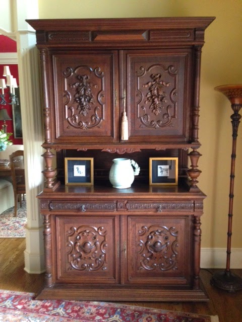
This unbelievably beautiful antique chapel cabinet is in the foyer
AFTER
Easy peasy, we cleared out the clutter and let the true beauty of this piece--the ornate relief work on the doors--shine!
BEFORE
The other side of the foyer features a beautiful staircase and runner
AFTER
We removed the large bench, opting instead for two lovely armchairs.  We added strong navy trimmed accent pillows to establish the injection of blue in the foyer as well as blue ceramic pieces to the tabletop décor.  We put away the dried arrangement and chose to use fresh peonies from Whole Foods and greenery from our client's backyard to showcase the client's vintage vase.  Because the home is currently on the market we did not add art to the walls unless it could be hung on existing hooks (yes we are just that obsessive about our clients' homes!).  For that reason we added the client's bunny art on a stand on the table and a sculptural floor lamp to give the space added interest
BEFORE
Dining Room
AFTER
The dining room is a delicious and intense shade of red.  Again, we put away the dried arrangement and went instead with smaller hydrangea arrangements in blue and white transferware.  We switched out the dining chairs for some larger scale arm chairs to flank the buffet and added a beautiful piece of art to replace the smaller mirror.  This particular piece of art is not original, but it is without question one of the most beautiful pieces of off-the rack that I have ever seen!  I LOVE that it has shades of light blue and the finish is fantastic. 
BEFORE
AFTER
We removed the silver tea service and replaced it with a blue and white ceramic lamp and a piece of the client's vintage art.  The blue flowers  (which suddenly show up!) in the gorgeous tapestry give it new life!
 
BEFORE
AFTER
We added sumptuous accent pillows in various shades of blue along with matching porcelain lamps and ceramic garden stools for a strong injection of color in an otherwise neutral space.  We switched out the framed prints for two abstract canvases and brought the smaller side chairs from the dining room to use to flank the curio cabinet.  To stay within our strict budget, we did not switch out the rug, but I really feel like a good quality, authentic oriental rug sometimes has chameleon like properties and can work in any space:)


 AFTER
We used these side chairs pulled from the dining room to flank the curio cabinet/display case.  I love the simplicity of this picture.  The art here is enough.


 AFTER
The gold chair has some blue detailing that we accentuated with the lovely floral embroidered accent pillow
AFTER
Blue accent pillows, cut glass and a gorgeous lamp make this neutral vignette a little blue heaven!

Sunday, May 25, 2014

A Sow's Ear

This weekend, Mark and I moved his business into a different office-- into an actual office building as his business has always been in our house.  It is a small office space in a beautiful historic building in our city, but the interior is not what I would call um, stylish.  Mark was totally not concerned that his office space was, oh I don't know what word to use, wait yes I do, UGLY; he travels all the time, spends very little time inside his office anyway, and was quite content to move his desk, his chair, his computer and his client files into the homely little spot and call it a day.  Well that's not how I roll.  After spending a quarter of a century with me, he should know this, right?

He did not want to spend ANY MONEY!!!  NO MONEY!!! NO MONEY!!! In addition, this move was a hasty one--the space became available and we had to grab it and get set up before Mark leaves town for a month.  So I was forced to use ONLY WHAT I HAD, IN ITS CURRENT CONDITION (no time to reupholster, paint, etc) to transform this dump, I mean office suite, into a pleasant professional work space.


He's cute, so I did it.

I dug thru the attic, thru the basement, stripped his current home office and made a couple of trips to Mom's warehouse in north Arkansas and with the exception of window coverings, we are set!  I will not pretend this is a perfect silk purse.  There are lots of things that I would do differently with a nice budget and a wonderful, large, well-equipped space.  It is, however, a great example of using what you have and adapting, improvising, and overcoming some design challenges.  I hope you enjoy the before and after photos!


BEFORE:  This is the front office, the glass doors lead to the hallway/elevator area

AFTER:  Antique desk, salvaged wooden guest chair, trout prints, lamp and inexpensive ceramic horse from the basement.  

BEFORE:  The front office, view from the entry--I'm not exactly sure what the niche space on the left is or was supposed to be, It could use some shelving and/or cabinetry, but remember we couldn't spend any money--NO MONEY, NO MONEY!!!!  And since I didn't have a big naked David sculpture, I had to think about it  The space behind the louvered doors is full of wiring and some lower cabinets

.
AFTER:  Barbara A. Wood's "The Violinist" print (which I still LOVE) and a couple of flanking gold medallion prints were substantial enough to fill the wall that faces the hallway

AFTER:  Original abstract by local artist Jeannene Vowell adds some color to the front office, and a Nest Blue Garden candle makes the whole place smell heavenly!!

AFTER:  And then there's that wacky niche--it will just have to be until we can have some shelving and cabinetry work added.  I have a super bad feeling that when I am not in this office every day there will be junk stacked here, paper boxes, printers, etc.  But that's ok--eventually maybe we can get some doors:)

BEFORE:  This is the larger office, look at that light fixture!  There are two of them in this space, I kind of like them!  
 
BEFORE:  Opposite view of the larger office, note the wet carpet, that's a small air conditioner issue that we feel certain will be addressed later this week (hahahaha)

AFTER:  All kinds of treasures from our attic and basement, including our first breakfast room keeping table that Mark is using as a desk now and the host chairs from our very first dining room when we lived in NLR so long ago!  

AFTER:  small round table from our old friend Wayne Hogan and antique chairs my precious Betsy Pickle left me when she moved to DC create a conference area

AFTER


Friday, May 9, 2014

Can't Wait for Spring Break Luncheon--Photos by Photography by Melisa

Earlier this spring, Grace & I hosted a luncheon for the PA Senior Girls' Basketball Team--it's a PA tradition that the girls' moms provide lunch on away game days.  Since we had been through a couple of rough, cold, icy winter months, we opted to take the opportunity to look forward to better weather and of course, Spring Break at the Beach!
  
We started with some springy tablescapes--the boxes were so pretty and bright; each contained coconut lime bath gel and body lotion to go along with our beachy, spring break theme


We added fruit and lots of carbohydrates (yikes!)


Love the dipped apricots with the orange table decor:)


And some precious girls


Festive decor, fine girls, fun day!  


Sunday, March 30, 2014

Hippity-Hoppity! You know what's coming! Photos by Photography by Melisa

Tulips and daffodils and hyacinth mean sneezing at our house, but they also mean Easter is coming up!  Mom and I are busily preparing for a home-freshening for one of her long-time and most loved clients, but in all the chaos, I didn't want to forget to share our Easter brunch and tabletop ideas. 

Easter is the second favorite holiday at the Malcolm house--we usually celebrate with a "young, fat hen" and dressing, asparagus, deviled eggs, Sister Schubert rolls and mashed potatoes.  I think we celebrate it with a lot of gusto because it represents not only the rising of our Savior, but also it signals a season change, a renewal, and a return to life outside our windows.  This year, the 5 of us, Mark & I and the girls, will celebrate with an easy mid-morning brunch, leaving all afternoon for egg hunting and the traditional wiffle ball game in which we use Easter eggs, not wiffle balls, thereby totally trashing the entire street with boiled eggs and shells.  Those things explode like grenades when you hit them with a wiffle ball bat!


I think I have mentioned before a book that I love, The Collected Tabletop by Kathryn Greeley.  She subscribes to the same belief that I do, that any space is better, including your tabletop, when it has history.  I rarely create any room, home, or tablescape for myself or my clients that is strictly "new".  It is special when it reflects the individual or family it serves and including items with historical and sentimental significance is the best way to add that special touch!


For this brunch, I used my Mom's original sterling flatware that she chose when she and Daddy first got married.  I think it is beautiful, it is simple and elegant.  My precious LouLou's vintage china cups and saucers are springy and lovely and my Mema's milk glass goblets--you can just see the stem up there, top left--are all tabletop elements that are very  meaningful to me and my family.


I am a huge believer in a high/low mix unless the occasion is super formal.  While we occasionally host or attend super formal events, I would have to say that it is more fun to have a little more leeway in your table design.  The beautiful banded china dinner plate was a gift from my Aunt Dot who taught me how to throw a party  She was a consummate hostess who is probably responsible for my entertaining genes.  The dinner and salad/dessert plates are fine china but I think they mix well with the sweet Caskata bunny plates (relatively inexpensive) and the flea market egg cups (very very inexpensive:, like 6 for a dollar inexpensive) 


The inexpensive ceramic bunnies look perfectly at home with the Baccarat and Waterford eggs--the mix is what makes it work, in your home, in your closet, on your table!


Lovely!


 And hey!  I made those napkins last year!  They are simply flour sack tea towels with transfers, Tres French and Tres EZ!  Trust me, I'm not crafty, if I can do that, anyone can do that!


We will serve from the bar a super easy make-ahead breakfast casserole, I will try to remember to post the recipe in the next few days.  The buffet will have bisquettes (that's canned biscuits, cut in quarters and brushed with egg whites, baked till golden, they are beautiful and just the right size for little ones), real butter (it would be nice if you could find some real homemade butter.  My BFF Sandy Massey's grandmother Lola made real butter when I was little and we called it oleo), fresh apple butter and blackberry preserves, iced shortbread and fresh strawberries and blueberries


I'd like to take credit for this beauty, but any fresh fruit in my Mema's milk glass compote is going to be stunning.  Please note the beautiful iced shortbread by my friend Sarah DeClerk who is truly an artist.  If you haven't called her already, get in touch with her soon at Ann Potter Baking!


Look at these things, everything she does is like a work of art!


Can you see the little lamb butter dish?  It is so cute and Easter-ish, and of course, I do have an affinity for any little lambs:)


A little better pic of the lamb butter dish


There's another, this one is from Peter's Pottery.  Peter apparently split from the McCarty's.  I still much prefer the McCarty's dinnerware, but Peter's lambs are awesome! 


Fresh forsythia in the crazy lady's head, so pretty--also had I straightened the bottom panel, this would have been an excellent shot of the gorgeous tablecloth made by Linda McNeil of Batesville, one of two amazing seamstresses I use almost exclusively, the other being Linda Taylor of Oxford.  The Linda's of North Arkansas are so talented and create from fabric what I see in my head!


One more shot of those beautiful strawberries in the milk glass and Sarah DeClerk's iced shortbread.  It's almost too pretty to eat.  But I will.


Happy Easter and Happy Spring from all of us!